

Case Study: Writing Short Is Hard
Branding + Website Design
As Writing Short is Hard sought to expand its target audience beyond academics to appeal to artists and other various groups, crafting a cohesive and consistent brand was integral. Beyond independently redesigning the website using UX/UI principles to enhance the navigational experience, I also spearheaded Writing Short is Hard’s visual brand development over the course of 3 months.
Company
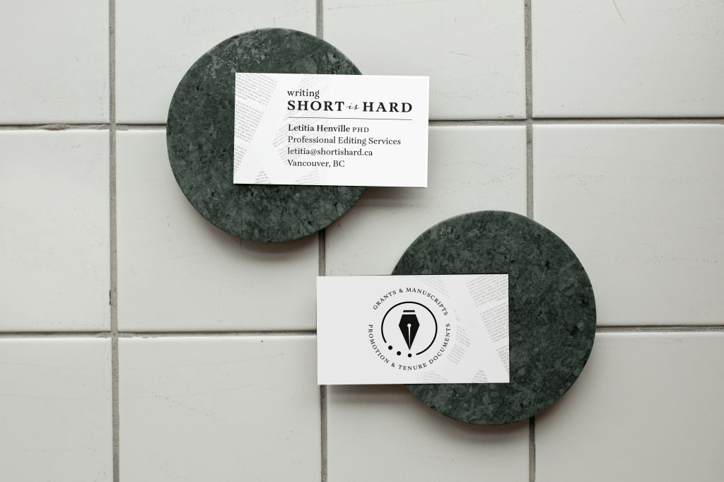
Writing Short Is Hard
Timeline
3 Months (Contract)
Role
Brand & Digital Marketing Consultant
Date Completed
March 2021
Quick Jump:
The Client
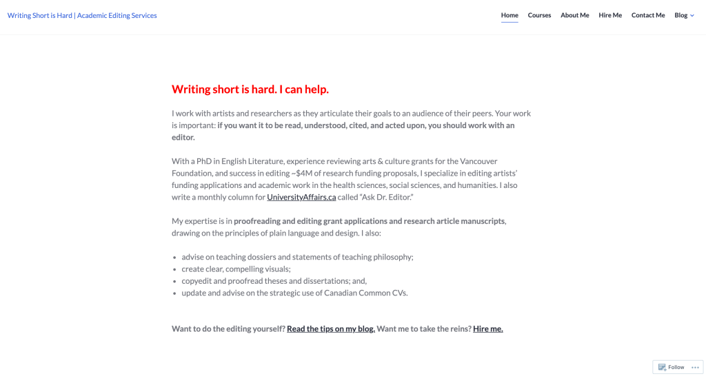
Writing Short is Hard Consulting Company, a business run by Letitia Henville, PhD, provides editing services and training to an array of target demographics, notably research administrators, academics, and fellow editors. In the expansion of providing grant application services to artists, the initial brief involved performing a WordPress website redesign to enhance the navigational experience and to appeal to all users.
The Task
In strategizing and planning the website redesign, I noticed the lack of cohesive brand identity across the business’ visual collateral – thus, my tasks developed into the following:
- Develop a visual brand identity, including (but not limited to) a logo, colour palette, fonts/typography, as well as imagery/photography.
- Reconfigure and rebuild the Information Architecture (IA) of Writing Short is Hard’s website, keeping in mind the needs of both previous clientele (i.e., academics) while also appealing to new user personas (i.e., artists)
- Redesign the website utilizing UX/UI principles, ensuring that all visual elements are in line with Writing Short is Hard’s brand identity and guidelines
Process

As this was a short-term contract, I ensured that I stayed on track by creating a detailed project timeline to manage my time and to ensure transparency between the client and myself. I determined that it would be most efficient to develop Writing Short is Hard’s brand first, followed by redesigning the website and incorporating the visual collateral throughout the site.
1. Research & Discovery Sessions
To begin the branding process, I delved into competitors’ websites and evaluated their branding elements – I also analyzed Writing Short is Hard’s current website to establish potential pain points and ways to elevate both the navigational experience, as well as the aesthetics.
After conducting my initial research, I held several discovery session meetings with my client where we discussed expectations, as well as walked through the current brand, the customers, as well as the goals of the business. Upon uncovering some primary pain points together, as well as delving into user profiles, we discussed potential brand colours and fonts. Some of the words used to describe the brand include the following:
- Supportive
- Knowledgeable/Experienced
- Credible
- Empowering
- Open/Transparent
2. Branding: Development of Assets
To begin the design process, I gathered the information derived from the discovery sessions to create stylescapes for each of the 3 user profiles identified.
- User Profile 1: The Experienced Professors/Academics (current customer)
- User Profile 2: The New Professors/Academics (current customer)
- User Profile 3: The Artists (prospective customer)
Due to the similarities between the first two user profiles, I ended up creating two stylescapes: one to encapsulate User Profiles 1 & 2, and another for User Profile 3.
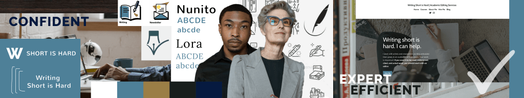

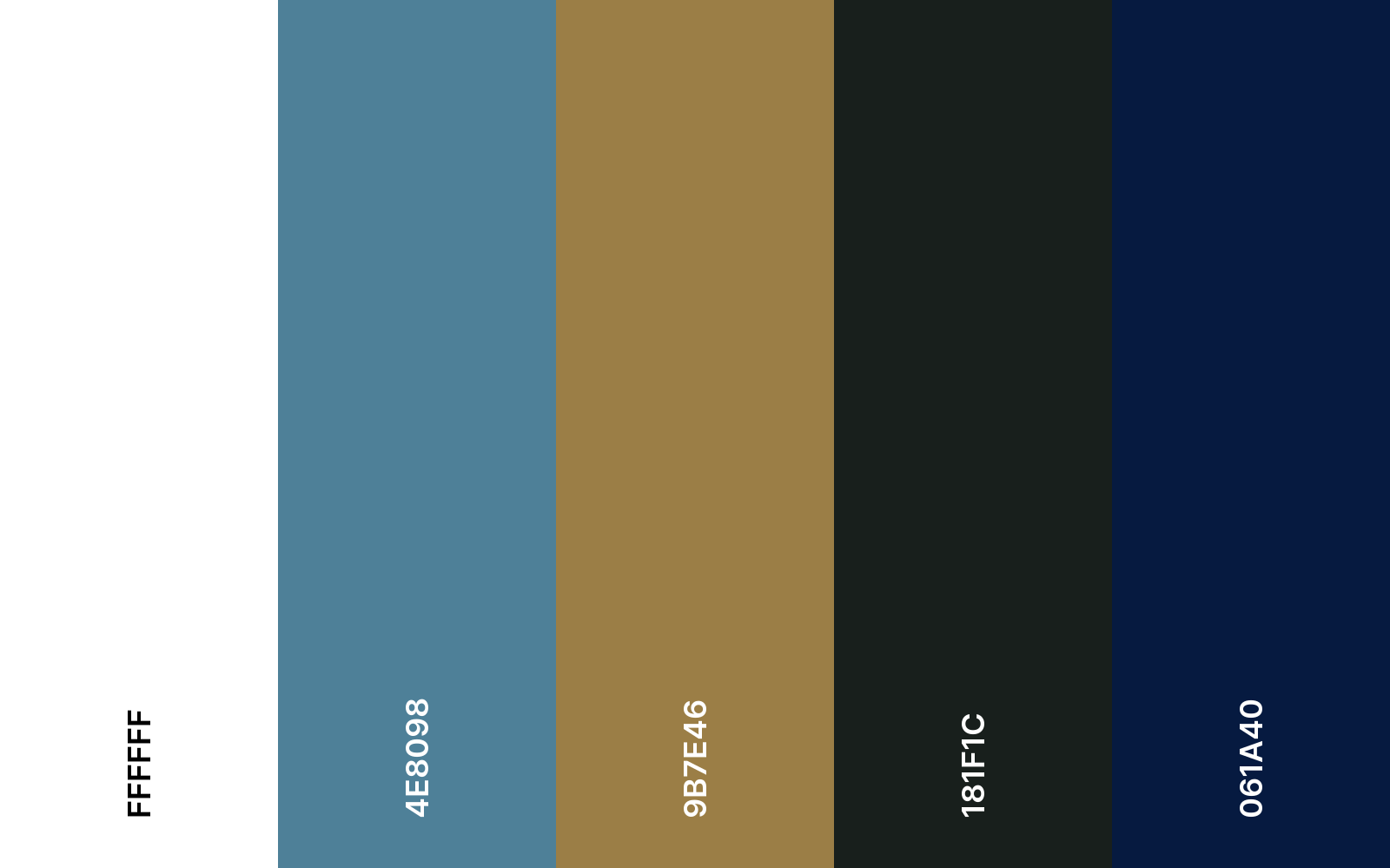
The client and I decided to move forward with stylescape 1 with minimal changes. Thus our fonts (excluding the wordmark and other logos) were set as Nunito and Lora. The brand colours were established as the following —>
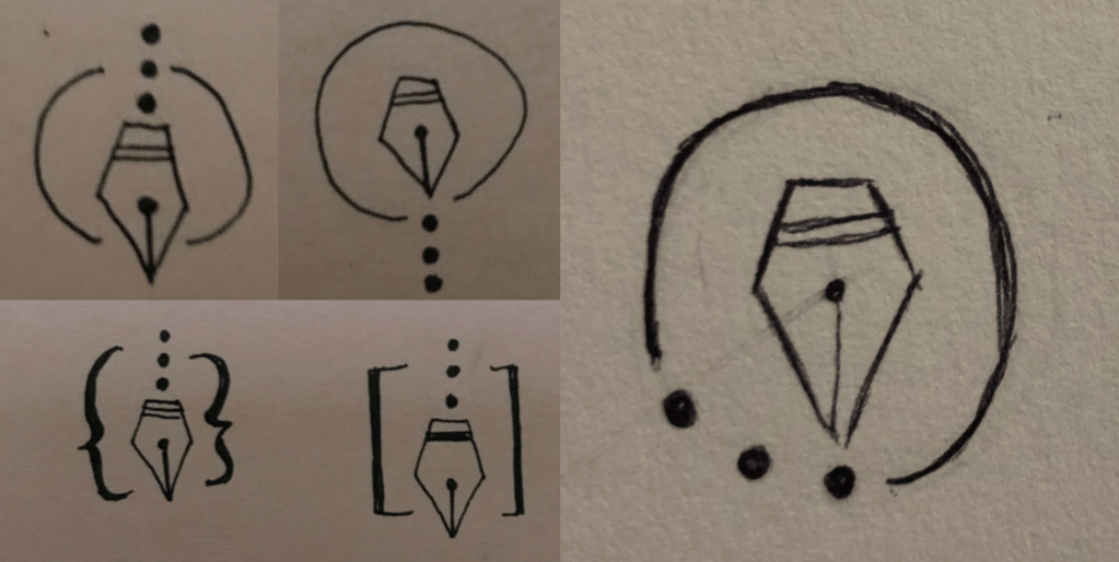
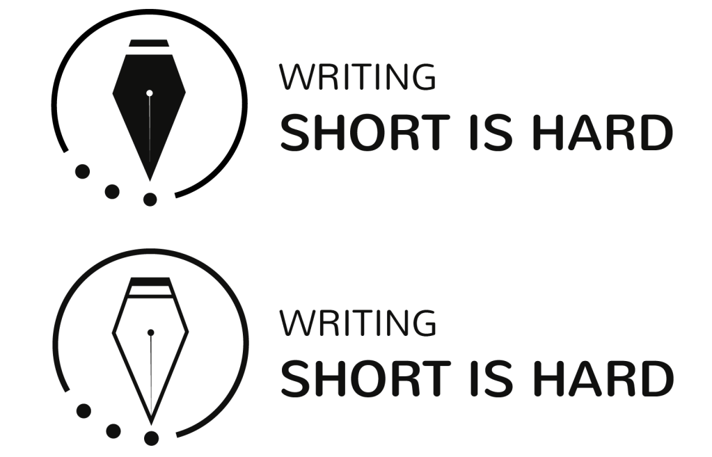
The early stage of logo creation involved discussing symbolism – the client expressed interest in working with symbolism related to pens, books, punctuation, and other objects related to writing and editing. I was particularly intrigued with the tip of a fountain pen, as it not only has a recognizable silhouette, but also can be simplified. I toyed with the idea of incorporating punctuation into the design and settled on the comma, as commas typically contribute to lengthening a sentence. Thus, manipulating the pen’s ink directly into the shape of a comma could allude to the name of the brand itself: Writing Short is Hard. I created all of the logo designs using Adobe Illustrator.
However, the client preferred the idea of more simplistic symbolism and wanted the wordmark to be the focus. Ellipses were also mentioned as a preferred symbol to represent the brand. Thus, I sketched out various possibilities for this new symbol and created mockups.
3. Branding: Consulting with a Designer
Due to this being my first branding and design project of this scope, I got in touch with Flora Gordon to provide guidance on my visual branding elements thus far. Through several meetings, I received instrumental constructive feedback on my design, as well as tips for wordmark creation. Thus, the next step in the process was to incorporate the feedback into refining the existing logo drafts and to create wordmarks for my client.
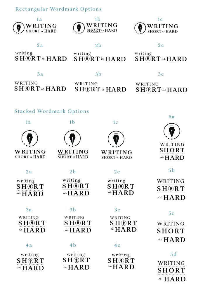
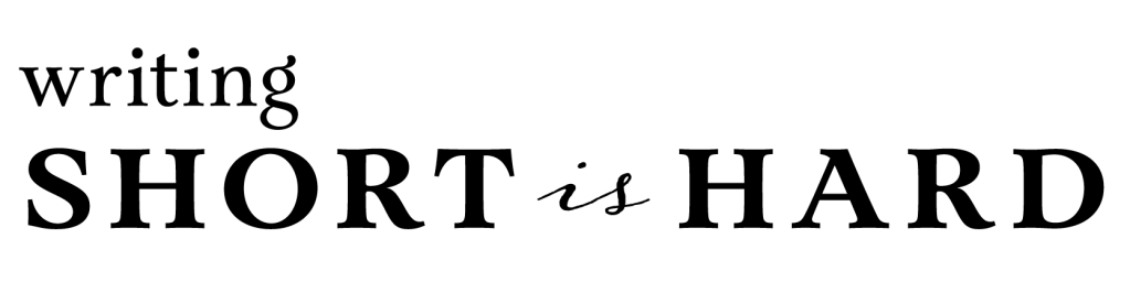
In creating the wordmarks, I considered numerous fonts, but eventually decided on a combination of Aria Text G2 and Adorn Garland. I felt like these fonts captured the academic side of the brand, while the symbol appealed more to the newer user profiles. I also manipulated the symbol in various ways, experimenting with having it beside the wordmark, as well as incorporated into the “o” in the word “short”.
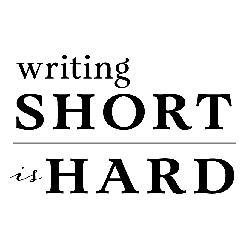
After consultation with my client, we settled on the following stacked wordmark. I utilized a combination of smallcaps, lowercase, and italics to place emphasis on necessary facets of the brand name: smallcaps was used to capitalize upon the brand’s shortened name (i.e., “short is hard”), while the lowercase provided balance in terms of weight. A rectangular/longer version of this wordmark was also created for the website header.
The next step was finalizing the symbol. Feedback from the designer included the following:
- Increase the size of the circle on the body of the fountain pen to heighten visibility
- Round the edges of the circle border to reference the circularity of the ellipses

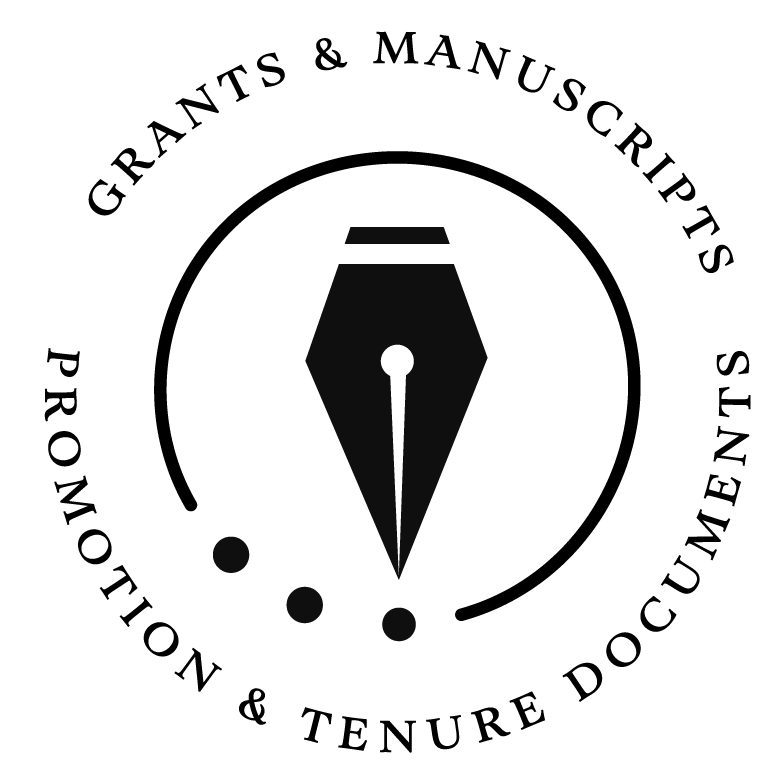
Thus, I incorporated these recommendations into a final version of a symbol, as well as an emblem for other document templates. In addition, I also created a smaller version of the symbol for the website’s favicon.
Once the client and I agreed on the final visual branding assets, I utilized Adobe Illustrator to design new business cards – Flora Gordon provided crucial guidance at this stage, as I was still fairly new designing business cards. I strived to adopt a minimalistic and timeless design that appropriately incorporated the new brand elements.
4. Website: Site Map & Information Architecture
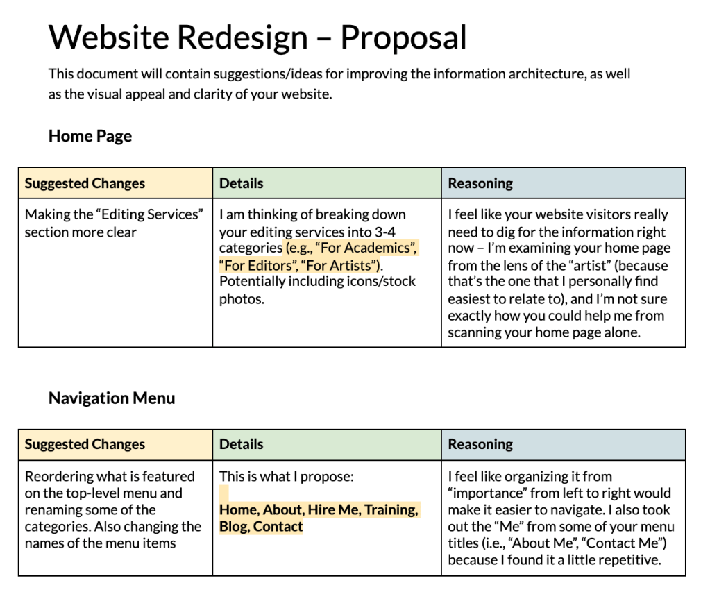
The next step was to rework the information architecture of the current website. To streamline this process, I created a shared document between my client and myself to note down all of my proposed changes. Some of my overall goals included the following:
- Less is more – using fewer words to have a greater impact
- Navigational ease – users needed to be able to find what they wanted as quickly as possible
- Increase in conversions – on the home page, I strived to have 3 main vessels for CTA: “hire me”, “contact me” and “about me”. On the old version of the home page, the CTA were at the bottom of the page; I wanted them to be at the forefront.
- Coherent layout – I wanted each page to feel cohesive, despite depicting different content
5. Website: Visual Design
Upon completing and gaining approval for my proposed changes to the structure of the site, I began creating mockups for each of the individual pages. I planned each individual page in Figma to navigate design alternatives before creating each page in WordPress. I believe that each page should tell a story and should aid in answering one of the following questions: “Who am I? What do I do? How can I help you?”
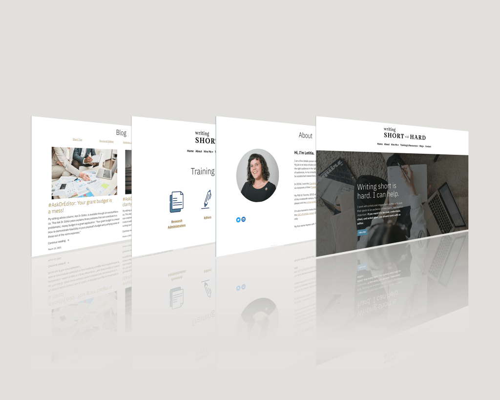
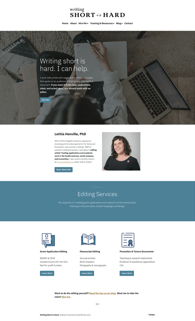

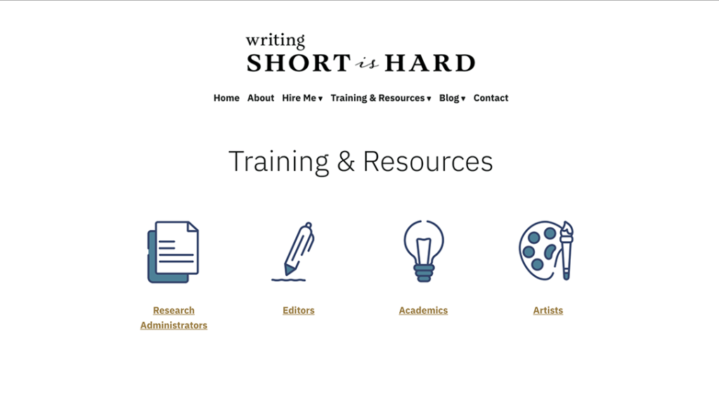
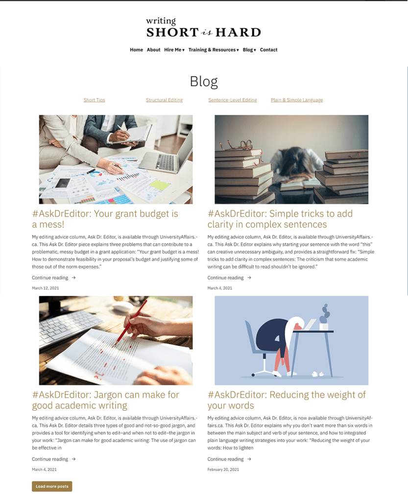
Beyond creating sample pages, I also designed mockups for some of the main pages to provide a glimpse into the website in action – ultimately, doing this aided in the visualization process and made the experience more immersive.

Impact & Reflections
Over the course of the branding and website redesign project, I created 20 visual brand assets, which include the following:
- 4 rectangular wordmarks (black, blue, brown, and white)
- 4 stacked wordmarks (black, blue, brown, and white)
- 4 symbols (black, blue, brown, and white)
- 4 emblems (black, blue, brown, white)
- 1 favicon
- 2 wordmarks for the newsletter, “The Shortlist”
- 1 “The Shortlist” newsletter banner
Other assets also included creating a YouTube thumbnail, a PPT/Word Template, and business cards.

At the end of the project, I also created a comprehensive Brand Style Guide, as well as a Transition Document. The purpose of these documents is to provide guidance on how to perform regular website maintenance, as well as how to employ the new branding materials – ultimately, it’s vital that the transference of site ownership goes as smoothly as possible.
Key KPIs
Six months after my suggested changes were implemented:
- Number of views: increased by 65%
- Number of unique visitors: increased by 37%
In the end, I grew immensely from this project. Not only was this my first time completing a branding project without prior experience, but I also needed to quickly adopt new skills and strategies in working with WordPress CMS, a platform I was not as well-versed in at the time. The core of any branding or design project is to listen to the needs of your client: with this in mind, I was able to successfully adapt throughout the life of this 3-month endeavour and to challenge my abilities as both a marketer – and also a designer.
This project would not have been possible without the support and guidance from Flora Gordon, as well as the trust placed in me by Letitia Henville, PhD – sincerest thanks to you both!
